Simple improvements for the sake of accessibility
So, since I ran Lighthouse on a few of my projects including Supplybunny, I was unhappy with the accessibility score in particular with Supplybunny scoring 73 and my side project 76.
Since then, I’ve made an effort to pay more attention to it.
Here are the main things:
- Image alt categories: such a simple thing, so easy to implement and so helpful. For products it can be as simple as
"Image of " + product.title. Bonus points that it’s good for SEO. - Titles and
aria-labelfor buttons, in particular for ones that are only icons. It makes complete sense, if there’s just an icon, a screen-reader can’t tell what it is, so adding atitleandaria-labelhelps lots. aria-labelfor inputs without normal labels. Sometimes fields have placeholders or elements that aren’t specifically<label>labeling them and this isn’t good for screen readers. So, adding aaria-labelto a field makes a difference.- Text contast matters even within the context of just normal design. Lighthouse, I’ve found, uses Level AAA conformance to Web Content Accessibility Guidelines which requires a 7:1 contrast. I’ve found the Color Contrast Accessibility Validator that lets you check background and foreground colors and see if they comply with various levels. Very useful.
As a result, I’m glad to say that Supplybunny’s score now is 87 – with a couple of contrast issues.
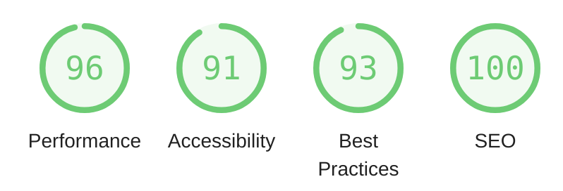
My side project clocks in at a very respectable 91.
I’ve also tinkered with it a bit more with the aim of getting all scores above 90:

Look at those beautiful green numbers!
