Another one of my pet peeves: when clicking on a navigational element requires you to click on the text exactly rather than on the container. There is no reason to make the user click on the text exactly, you can cut them some slack and increase the tap target.
A sub-nitpick is when the padding is on the external container rather than on the navigational element. That makes the navigational element slightly smaller, and you can’t click on the text.
One example I recall is Quickpolls – you must click on the option text exactly and not on the entire row.
The web is also rife with checkboxes that must be clicked rather than the label.
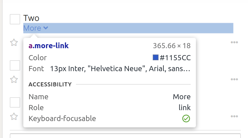
Ooradee, my todo app, allows clicking the whole row even for the “Less/More” link.

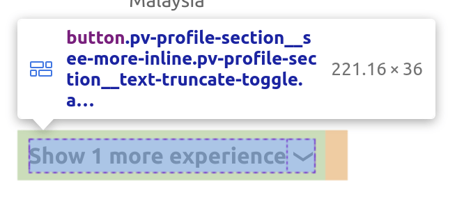
On the other hand, here’s LinkedIn where you have to click on the text exactly:

But Github has the whole row 👏👏

But HackerNews does not unfortunately:

